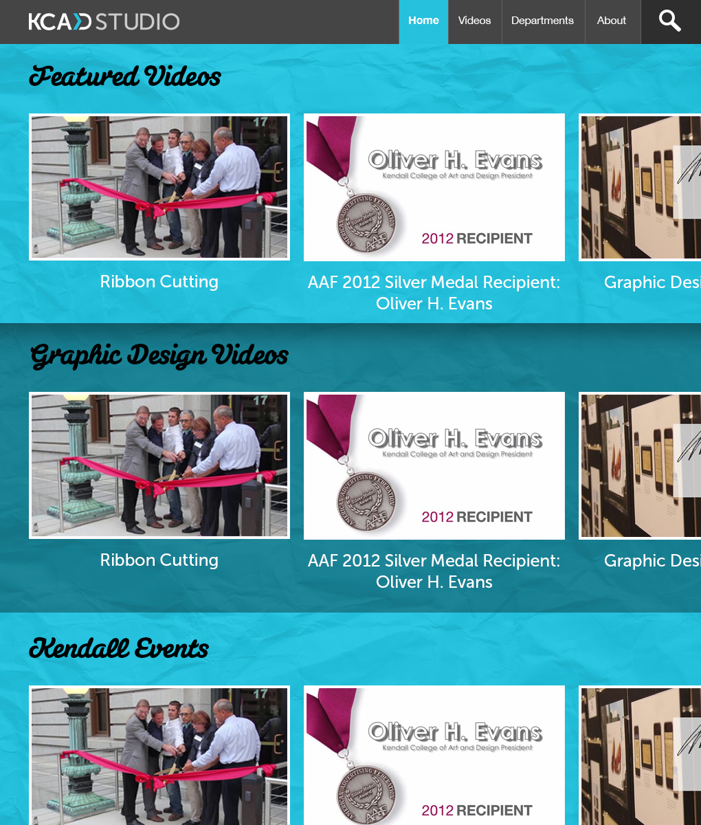
After a few drafts and quite a few sketches I've finally created a final design for the homepage of my thesis project. The goal is to create a site to use as a hub for all Kendall related videos that links to other sources to get more information.
I'm doing the design, branding, and development of this site. I figure this would be a great portfolio piece to show current & future employers that I can be given a complex task and reach a solution. While most likely I'll be working with teams it at least shows I can adapt and fill in whatever gaps I need to between myself and peers.
Colors
First, I wanted to really work with that teal color. I think it's a great color for the project in that it's visually rich, easy to work with and not too common to be over-used. It is a part of my school's branding so it does relate to the school.
Layout
The layout may not be anything mind-blowing new or innovative but that isn't a limit of my ability but the result of a decision to put the needs of our users above the value of my craft. I went through a few bad mockups and many bad sketches trying to think of a fun, creative way to express the content. But eventually my better senses kicked in: People are not going to use the site like vimeo. They will not be watching video after video, there are really two use cases:
-
Someone just looking at what is new with the school and recent events. These people may just view 3-5 videos before going elsewhere.
-
Someone looking for something very specific. These people may just want one specific video dealing with a presentation, a student's work, a class video, etc... so their pattern will be checking to see if it's on the top of the page within immediate reach or if they need to search for it.
So in that regard I felt making it look consistent with a 2012 website would be a good way to make sure the site is familiar to the broadest range of users possible.
Video Layout
The hardest part of the project so far has been putting my ego aside to try and come up with a presentation that really facilitates how it really gets used and not trying to make anything to show off my knowledge of the craft. So for the videos I came up with the idea of just letting them exist in rows. Each row can scroll left and right kind of like the Netflix site but by actually moving that area and not just the content in it. Also it will be moved by just moving the mouse or swiping with a mobile device. Second, upon scrolling to the bottom or all the way to the right more content sections will load. This way the whole site can be quickly browsed from the homepage if the user wants to do that.
Technology
The site will be written in PHP be creating a custom CMS module for my PHP MVC Framework I developed on the Comics Bulletin site. It's been built with the things that I like from Ruby on Rails and Django which has been a great learning experience on how those systems are built themselves.
